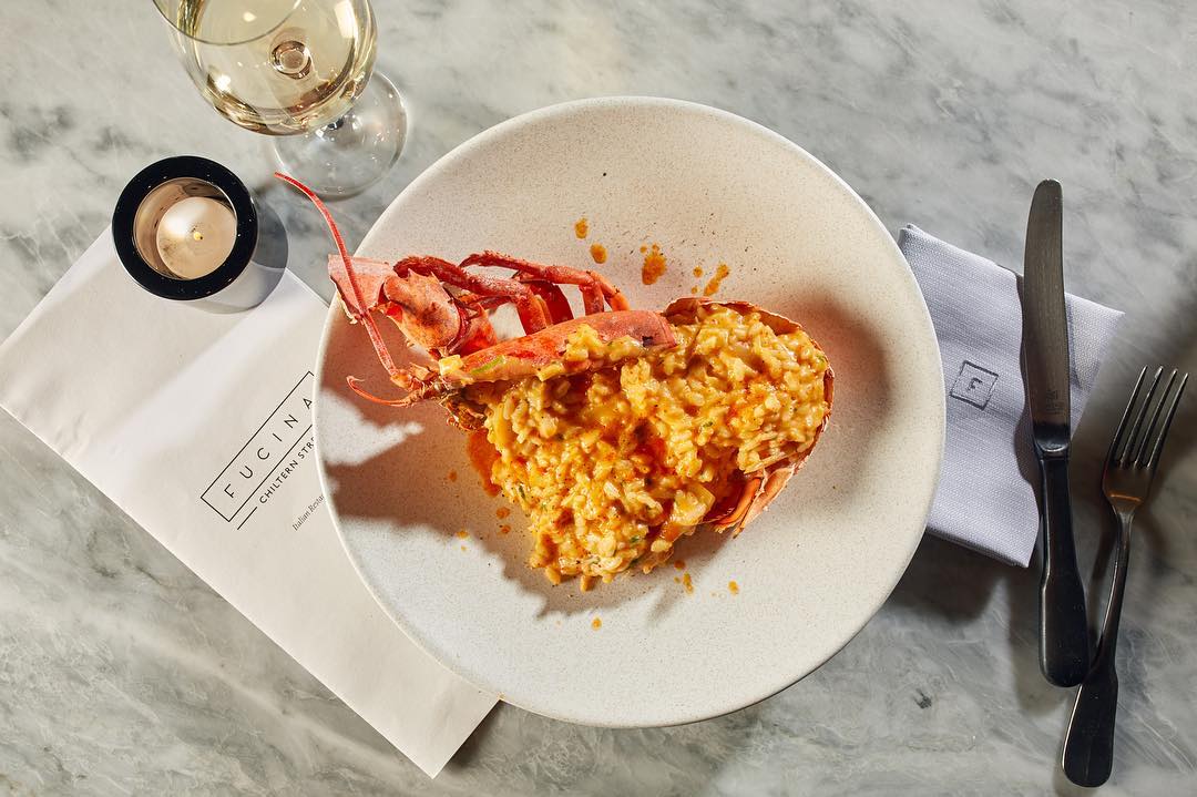
Brand Story for Restaurant Fucina
Reserach / Brand Strategy / Visual Identity / Creative Direction
Contemporary and honest approach to Italian Food is what sets this restaurant apart. Food is rich and textural and uses a whole palette of flavours. And this is what we strive to celebrate, in complete simplicity.
Fucina is an italian restaurant in North London. It is an organic restaurant with the farm‒to‒table approach. Branding was done around three main thoughts: quality for money / il dolce far niente - sweetness of doing nothing / italian lifestyle.
“We are passionate about food. Nothing is more important to us than the quality of the food we put on our plate. From the ingredients we source to the people who work with us, to the materials we chose for the interior design, to the culinary techniques we master, we remain true to the Italian heritage and to our promise to ourselves and our customers: to offer recipes that deliver the honest flavours of Italian cooking in a warm, welcoming, and modern environment.”
Inspiration for the font used in logotype was an old Italian signage. Only black and white colours have been used to create elegant and not too punchy look.
Graphic Studio: Superfutures


